Our client, a Dr. of Psychology, wanted to create a logo and website for her new solo practice.
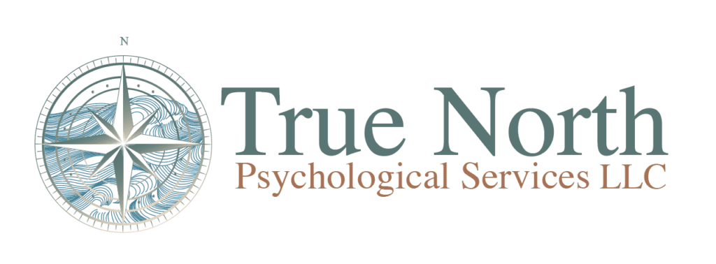
Our team as tasked with creating a logo that was nautical, had earth tones, and that conveyed mindfulness. We narrowed the colors down to a teal, blue, yellow-brown, and earth brown. We chose to create a compass rose and to include Japanese style waves inside the compass. The waves convey mindfulness as well as the turbulence that the psychologist can help manage with her client.
Once the logo was created the site had its color scheme ready to go. Working with the client we were able to create a website that also conveyed mindfulness and a sense of calm. Our client was very pleased with the outcome.
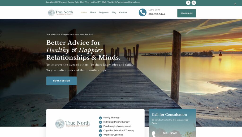
Check it out here https://www.truenorthpsychological.org
The Ripple Effect Group, in Rocky Hill, CT, can help you with your next website or logo project!
Reach out to us here help@theRippleEffectGroup.com .